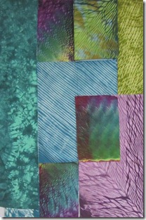
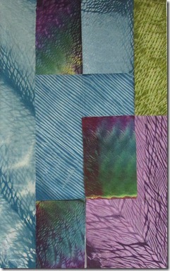
I am arranging and rearranging fabrics on my design wall. It has not yet clicked.
This is my first and second arrangements. I feel changing the multi color rectangle was good. Moving the turquoise long strip from left to right was not so good.
I made more changes but I can’t say I am pleased with any of them. I love some of the fabrics, but that is not what design and composition are about.
I am almost back to the starting point with two simple changes.There were a few other arrangements along the way that I am not showing. This is NOT the final arrangement. I will continue to work on this until it all comes together and I am pleased with it. Then, and only then, will I sew the pieces together.
When I make the final decision you will be the first to know.


5 comments:
Hi Kay- You're in need of deciding what is the focal point- all those luscious fabrics are competing with each other to 'star' in your little drama. When you decide where the focal point is, and then move out from that simplifying and paying attention to the directional signals in the fabric, I think you will be really happy with what you have going on!
Hi Kay,
Sandy was right about the focal point, and the fabric that keeps catching my eye is the green in the top right corner. Maybe it can be moved into the piece more. I always think a long strip needs to go on the left, maybe because we read left to right.
Your fabrics look beautiful. Makes me want to try shibori dyeing.
Good observation Linda. I had already decided that fabric was a problem - or at least in that location.
I've done another arrangement. I thought it worked. After photographing it and seeing the picture I also feel the new one doesn't work so I'll be heading up to the studio again soon.
Kay, The fabrics have such wonderful movement but the design seems too linear. Trying to keep all those straight lines seems to fight with the shibori patterns. Just my humble opinion.
beautiful fabrics! i agree, the green seems to be the focal point as the turquoise pieces are too similar...therefore, what if you made them a touch more prominent? larger, perhaps?
they have depth that you can get lost in.
i love some of your pieces, they look like feathers!
Post a Comment