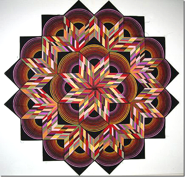
This is one of my Eight Pointed Star For One Armed Quilter quilts. I am so pleased with it.
The problem is I am having a hard time choosing the background to put around it to square it off.
I had planned on using black but found that since the black on the star area is a printed fabric so it is different than a solid black.
I’ve considered using some other colors but I’m thinking they may fight with the graphic star design.
If I finish it with this shape it will be very difficult to hang on a wall.
I plan on solving this dilemma soon.
9 comments:
Why not a black-on-black print? It will still give a black frame, but it will be a bit more lively and it won't matter if the blacks are different. It probably needs that dark to really set off the great colorful design!
WOW, WOW, WOW.....I'm in awe. Actually I very much like the look of this piece as pictured.....a grayed white...perhaps with a tiny, tiny black edge....cording?!?
I think I would go with a pale background. Look how good it looks on white. Perhaps a place yellow or one of the other lighter colors in the quilt.
What if you go with your original plan for solid black, and trim the blocks around the outside curves and applique them down to the black background?
I'm with Norma -- a super-pale yellow would make everything else pop (maybe? idk)
I have no problem with using a solid black next to the printed black. But I also could see a dark green, trending toward black, but picking up a bit of color from inside the quilt. Yellow pops forward...might work, but audition it first!
Also wondered about chopping the space up and filling with solids that repeat colors from inside, but toned down a bit. Again, have to audition ideas first.
I can envision a dark burnt orange. Judy's right, of course - auditioning necessary.
It's beautiful, Kaye. Perhaps the palest of lavender might help to echo the colors of purple and lilacs within the design in a subtle way.
I would pick one of the pale colors that you liked most from within the quilt and use that for the outside background.
Post a Comment