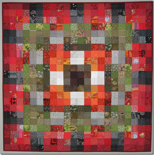
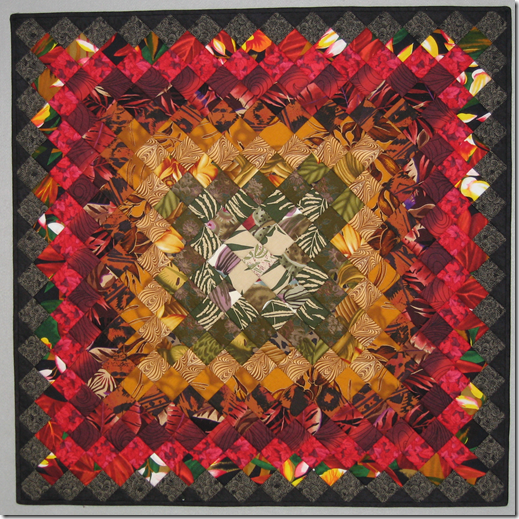
The responses to my previous post were so positive. I had many requests to see more of the quilts from this series. I present to you more quilts using commercial fabrics and squares.
This is the second quilt in the series and the only one that uses strips for part of it.
I used a layout similar to the previous one using squares and light colors rather than the black.
This quilt and the next are examples of showing how rules are not always true about how color works.
Same layout as previous quilt with the same colors used in different positions.
Remember the quilt I posted yesterday with the one dark square in the center? This is the exact same fabrics used in the opposing order.
I hope you are enjoying seeing more of the pieces from the show.
Monday, October 1, 2018
More Squares Aren’t Square Quilts
Subscribe to:
Post Comments (Atom)


3 comments:
This are really nice, Kay!!! How a simple design is enhanced by your choice of fabric(s)/colors!!! You're still my idol!
So many pretty quilts! Love seeing them!
Your quilts are outstanding! Thanks for sharing
Post a Comment