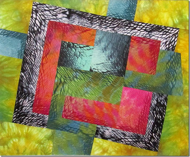
Glory Aura is finished. I absolutely love it. My friend Shelly also said it was her favorite.
I mentioned to her I had no place to hang it in my house. After she left I realized I could hang it over the TV cabinet in the sunroom.
I am going to share several versions of this from the first attempt on the design wall! Of course there are many others I didn’t photograph.
![[image%255B13%255D.png]](https://blogger.googleusercontent.com/img/b/R29vZ2xl/AVvXsEjGu2CtPFxTiSq_S91tmThGpIYGbegdwh_KeqPu8x3vCfD4nuDCj39isYHAhQb-ntPd7RNp-eqZIDZMAe96KBiEkUmLoIvacYlIDOu98hxWJae-pnqKkLVn-UqjpCP3_erxNcvSUpElSFY/s1600/image%25255B13%25255D.png)
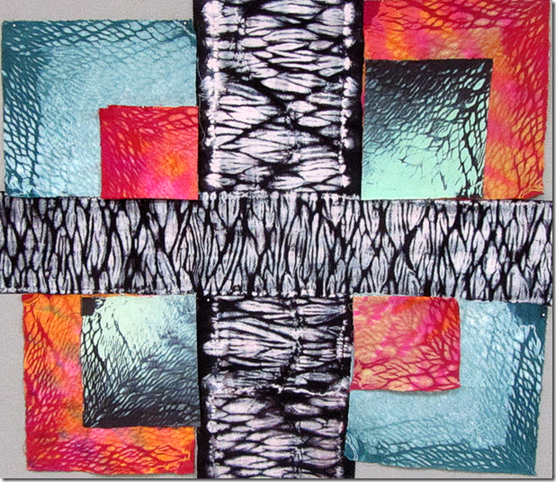
This is where I started. Of course I had no idea where I was heading. But one has to start somewhere.
Then I tried this.
Now I’m heading in the right direction even though I have a long way to go.
I subtracted several pieces of fabric.
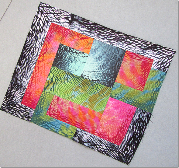
Getting close……but what can I use to border this with this irregular border?
I tried many things and these were the two most likely candidates.
The decision is made. Next decision was how to trim the borders. I decided I preferred it squared off to accent the original design.
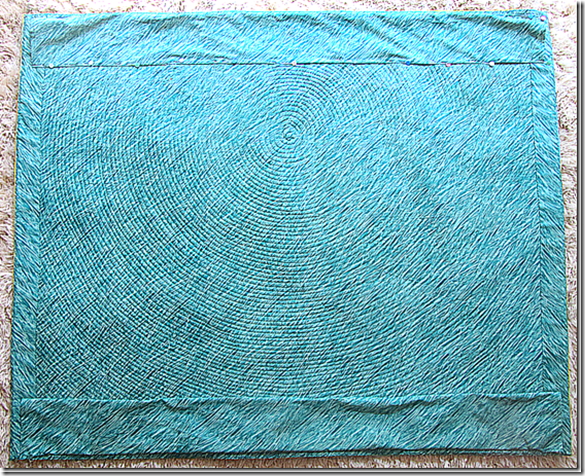
I was not able to get the quilting to show up on the front of the quilt so I am again showing you the back.
The circles are the perfect compliment to the bold graphic design.


5 comments:
count me in....it's my favorite too!
Hi!!! Yes...me too!!!! Although I do like several of the arrangements!!!!
It really is stunning!!! Love seeing your process!!!
Beautiful work, Kay!
Your placement of the shaded sides and arrangement of colors is masterful. Really, really nice piece!
And going back, I can see the quilting on the front (although it did help to know what I was looking for.)
Post a Comment